Screen Daddy Plus
Graphic Design / Web Design
Screen Daddy Plus is a home services company based in Lake Royale, NC offering repairs and maintenance to residential clients. As a freelance designer, I was brought on to develop a brand identity that gave the business a recognizable face — something that felt welcoming and memorable from the very first impression. My deliverables included a mascot logo suite, a brand pattern, and a full visual identity system built around the character at the heart of the brand.
.png)
Sketches
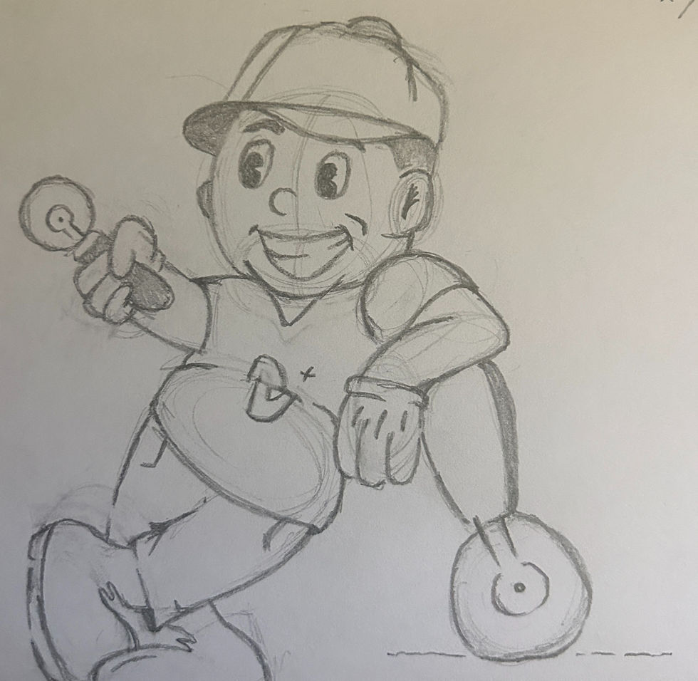
The ideation process for Screen Daddy Plus started broad. Early sketches explored purely typographic directions — playing with the wordmark, experimenting with screen-related iconography like door handles and spline tools, and testing different ways to visually communicate what the business does. It wasn't until I started sketching a character that everything clicked. Once I landed on the repairman concept, the direction became clear — a full-body figure, cap on, tools in hand, with the kind of round, expressive face that makes a mascot instantly likable. Getting there took iteration, but that's exactly where the best ideas come from.

_edited.jpg)


Logo Suite & Brand Identity
The Screen Daddy Plus mascot is a friendly repairman drawn in a retro rubber hose style — round, expressive, and full of personality. The thick outlines, exaggerated proportions, and soft circular forms give the character a nostalgic comic-book quality that feels warm and immediately approachable. A sticker-style white stroke wraps the entire mark, giving it dimension and making it pop across any background. In the primary badge mark, the mascot's head intentionally breaks out of the navy circle behind it — a small detail that adds energy and keeps the character from feeling contained. Heavitas and Grupi Sans carry the typography, pairing a bold, chunky structure with just enough playfulness to match the mascot beside them. The orange plus sign embedded in the wordmark ties directly back to the brand name while quietly reinforcing the promise of service and reliability.
Primary Logo

Secondary Logo

Submark

Brand Pattern
The brand pattern brings the mascot to life in a way that goes beyond the logo. Repeating character heads in varying angles and expressions are scattered across a warm tan background, punctuated by the orange plus sign pulled directly from the wordmark. The result is something that feels energetic and playful — the kind of pattern you'd want on branded merchandise, packaging, or a work vehicle wrap. It takes the friendliness of the character and turns it into something that fills a space.


Mockups


Screen Daddy Plus pushed me into territory I hadn't explored before — and I'm really glad it did. Designing a mascot from scratch challenged me to think beyond layout and color and consider how personality translates into a visual identity. It reinforced something I continue to carry into every project: that the best brands don't just look good, they feel like someone you already know.